More pages in this section
Our Logo
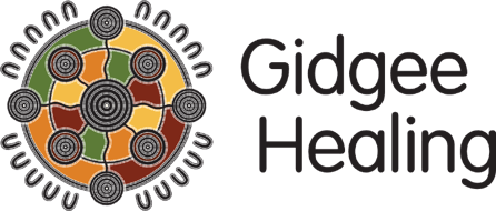
 The centre circle of the logo represents the Gidgee Healing organisation. The smaller outlying circles represent the communities in the region that Gidgee Healing currently supports and those it will grow to incorporate as we move forward. These circles are connected by culture, family ties and geography. The ‘U’ shapes around the outside represent the individuals and family groups supported by Gidgee Healing now and in the future.
Enhancing the use of colour was a key focus of the artwork. The red/ochre symbolises the land. The yellow symbolises the Gidgee flower. The orange symbolises the sun. The green symbolises the leaves of the Gidgee tree. We believe this new visual identity will carry us far into the future.


